
The Art of the Statement: 3 Rules for Styling Mural-Scale Drapery
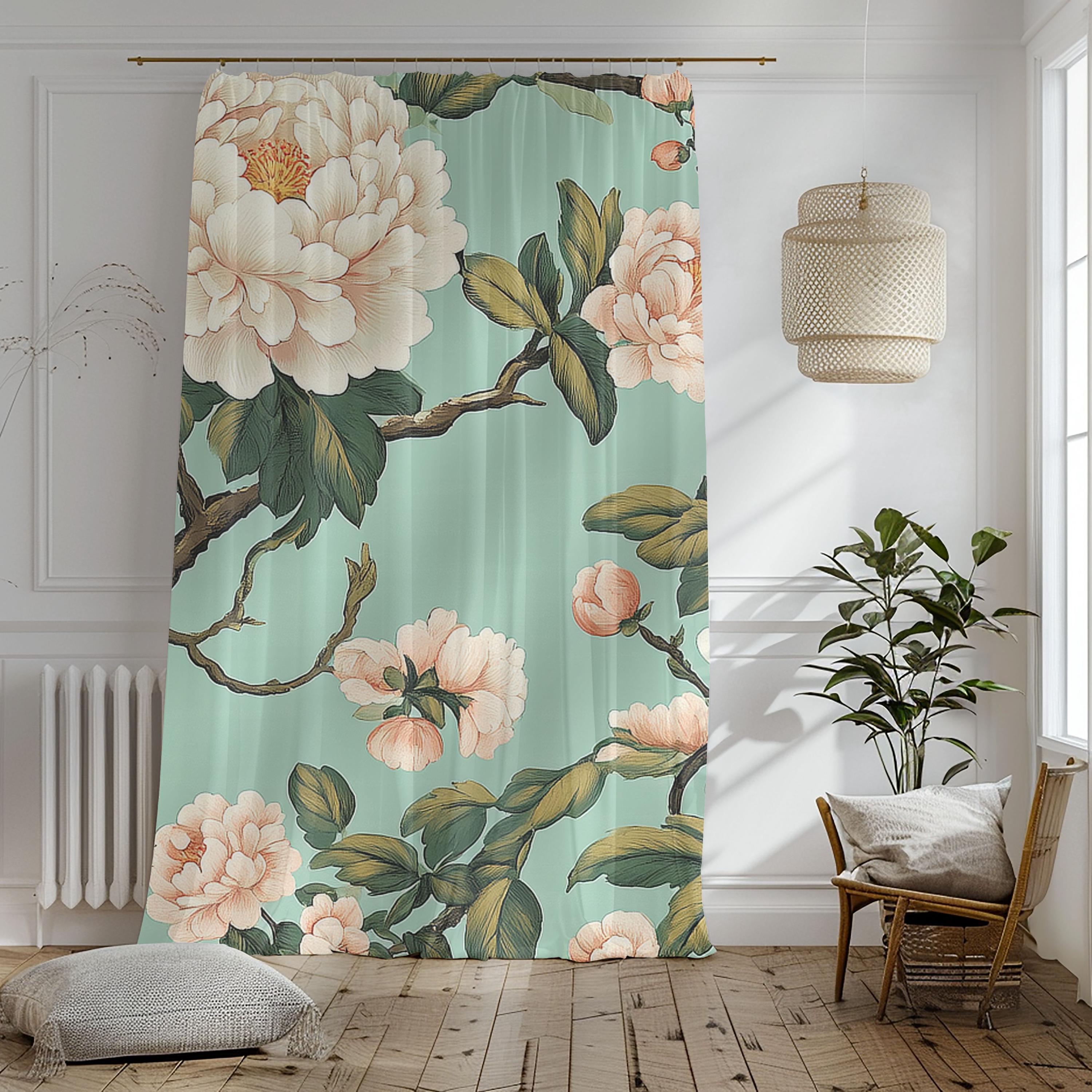
In a world of "safe" neutrals and small, repetitive patterns, there is a rare magic in the bold. At the Lisa Kanova studio, we believe your windows shouldn't just be covered—they should be curated. Our Mural-Scale Drapery is designed to act as a singular, expansive piece of art, bringing the sophisticated allure of a bygone era into the modern home. The Belvedere Botanical—with its creamy peonies and vintage teal boughs—is a tribute to the grand estate gardens of the past. If you’ve been drawn to these oversized florals but aren’t sure how to "anchor" them in your space, here are my three rules for decorating with high-impact statement panels.
Rule 1: Treat Your Windows Like a Gallery Wall
When the scale is this grand, the curtain is no longer an accessory—it is the Hero.
- The Strategy: Do not "tuck" these panels behind a heavy sofa or hide the detail with bulky furniture. Give the fabric space to be seen from top to bottom.
- The Why: Because our designs are mural-scale (specifically our 50x94 and 50x96 panels), the floral is meant to "grow" up your wall. By treating the window as a canvas, you allow the light to interact with the painterly brushstrokes, creating a living masterpiece in your sanctuary.
Rule 2: Master the "Static & Flow" Balance
High-impact florals need a stable environment to maintain that "Proper and Royal" sense of order.
- The Strategy: Pair your statement curtains with solid, architectural furniture. For the Belvedere, I recommend anchoring the room with an espresso wood coffee table or a dark, clean-lined console.
- The Why: This creates a balanced, Modern Heirloom look. The "static" weight of the dark wood balances the "flow" of the botanical vines, ensuring the room feels intentional and expensive rather than cluttered.
Rule 3: Commit to the "High-Low" Contrast
One of the most effective ways to make a statement is through intentional contrast.
- The Strategy: If you choose a moody, saturated botanical like our teal-based Belvedere, keep your wall color crisp and light. If you opt for our Luminous Sheers, consider deep, rich furniture tones to make the colors "pop."
- The Why: Contrast is the secret to a room that looks Designed for Impact. It’s the difference between a room that just "has curtains" and a room that feels like an editorial feature in a design magazine.
Complete the Manor Look
A truly "Classy and Unique" home carries a theme through every detail. Our Belvedere Heritage Collection allows you to bridge the gap between your windows and your living space with functional art.
- The Accent: Carry the botanical story to your seating area with our matching Nesting Tables or a curated Statement Lamp.